You might have noticed we have a new look. Read on to learn more about the development of our new brand identity.
The backstory
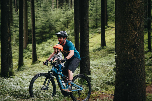
When we first launched the Shotgun seat in 2017, we never imagined our little company would grow as quickly as it has, or be so well received around the world. It's been a super exciting ride so far, and we're absolutely stoked to have already helped so many mountain bike families spend time together.
But we're only just getting started.
Now, we’re transitioning from a single product business, into a brand with a range of products for mountain bike families. We're no longer just a shotgun seat business, we have big plans – and we need our visual identity to live up to our aspirations!

Our purpose
Although we’re changing our look, our purpose remains the same – we’re on a mission to raise the next generation of mountain bikers around the globe.
We believe:
- In getting kids off devices and onto mountain bike trails
- In parents spending quality time with their kids
- In fostering a love of nature and the outdoors
Our philosophy
We believe that riding, and everything it offers, helps positively develop kids, and leaves a lasting impression on both parent and child. And we believe that this is genuinely good for the world.
We believe that now more than ever, it's also important to free up time from busy urban life. To reconnect with nature and experience its power and beauty from the front seat - in the moment, together.
Connection and freedom
Our new brand serves to visually represent our purpose and philosophy above, but it also goes much further. Our new identity communicates the universal desire of connection and freedom.
Connection is about sharing special moments together, whilst making life-long family memories, on and off the bike.
Freedom is about encouraging our kids to tackle the challenges of the trails and the world independently, all whist resisting the urge to over protect them in cotton wool along the way.
The process
Armed with our purpose, and the core concepts of connection and freedom, we set about developing our new visual identity with the help of New Zealand based agency Virtuo.

The development process of the new Kids Ride Shotgun logo mark.

Our new logo mark
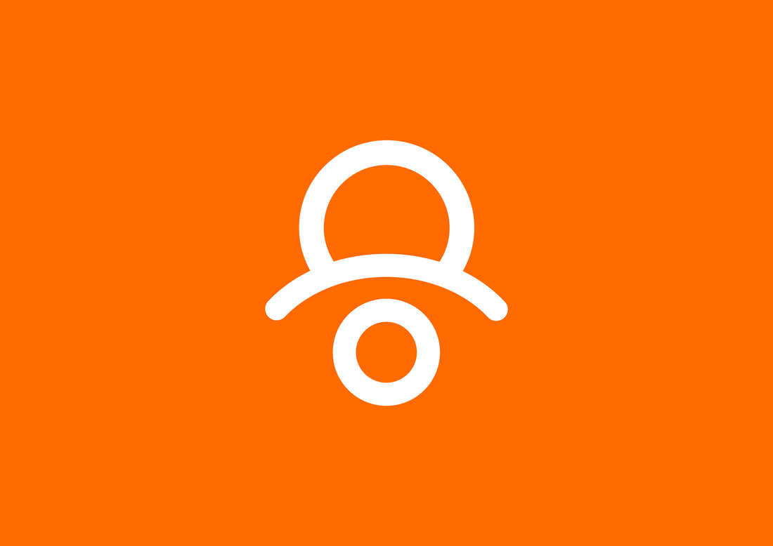
Our new logo reflects freedom and connection by showing the parent and child within the cockpit, whilst also emulating the outdoors that we explore with them.

We feel that the result of the work above, is a beautifully simple icon that accurately reflects our business and purpose. We're pumped!

We’re excited about what lies ahead, and our new brand starting to roll out across all touch points, online and in-store. A special mention to Virtuo agency who helped us with this project. And a special thanks to our friends, family, customers, retailers and distributors which have helped us on the journey so far!


